
A favorite trick of home stagers is to pay attention to the hottest colors and incorporate those hues into the design and look of a home. That’s something that anyone who is selling a home should consider, and all it takes is a little research. To help people with ideas on how to decorate rooms, paint companies and designers announce their colors of the year along with trends in color palettes.
For 2017, Benjamin Moore has chosen Shadow 2117-30 as its Color of the Year. The color is a deep, rich violet or amethyst and is described as “exhibiting a variety of nuanced undertones as the light in a room shifts during the day.” This color has already made its way into various industries including textiles, home accessories, fashion, fine art and automotive.
Sherwin-Williams’ color palette trends for 2017 focus on renewed spirituality, body and soul nourishment and a determination to define a sense of self. Each of its four palettes (each of which consists of 10 colors) tells a distinct color story, offering opportunities for homeowners to explore color in new and exciting ways.
The first palette, Noir, is driven by baroque and romanticism trends, a renewed interest in faith and spirit, and a celebration of the night. The Noir palette is rich with colors that evoke vine-ripe fruits, Nordic blues, moody neutrals and golden yellow.
The company’s Holistic palette includes arctic neutrals, blush rose, wild browns and forest-floor green.
Intrepid is a palette inspired by impatience for social and political change and includes fiery oranges, vibrant kimono colors and the simplicity of black, white and gray. Finally, Sherwin-Williams Unbounded palette is influenced by global immigration and how it redefines national identities. Captured in this palette are earthy mustards and browns as well as ocean blues and corals.
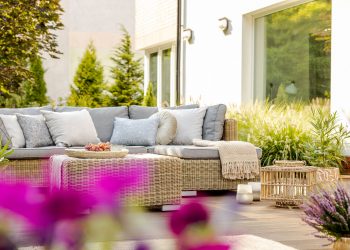
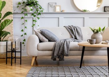
Other colors that designers seem to be gravitating towards in 2017 include colors that bring a feel of the outdoors— greens, blues and earth tones, though a splash of royal colors of purple and orange seem popular as well. Green invokes nature, tranquility, and being more peaceful, and earth-toned taupes make you feel more grounded.
Now that you’ve come up with the colors, it’s time to put them to good use. Painting rooms is the most obvious way to incorporate them into the home, but you could also bring in furniture, rugs and decorative accessories in trend colors to help your home stand out from the rest.
I hope you found this information helpful. Contact me for your real estate needs today!


