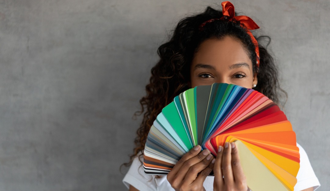
Companies use color trends to boost brand awareness and product sales, but the research behind colors and how they impact consumers is anything but arbitrary. Color trends aim to appeal to emotions caused by world events, history and cultures, the economy and the human need for change.
Consider Tiffany’s aqua blue, recognizable around the world as a symbol of elegance and sophistication. Or Coca-Cola’s signature Christmas red that forever changed the color of Santa Claus’ iconic suit.
Architectural Digest notes that since Pantone Color Institute’s introduction of its first Color of the YEAR (COTY) in 2000, a subtle blue called Cerulean, many paint manufacturers are announcing their own COTYs, as well as curated “collections” of the year.
When you look at the color trends for the year collectively, you’ll see that the colors have characteristics in common. They help promote familiarity, serenity, coziness and comfort.
Behr’s choice for COTY 2020 is a fresh split-pea green called Back to Nature. The Behr 2020 Color Trends palette was inspired by “natural elements such as sky, earth, water and plant life.”
Sherwin-Williams’ 2020 COTY is Naval, a classic ocean blue. The company’s 2020 palette is called Simply Blissful Color Collection.
A pale peachy pink, the color of dawn, is called First Light, BenjaminMoore.com’s selection for 2020. Their Color Trends 2020 palette combines “optimism and understatement.”


