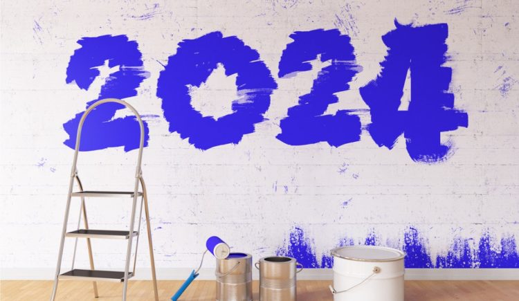
The 2024 paint colors of the year have arrived. The colors for the upcoming year are unveiled every year in the late autumn. Often, these colors predict what the approaching year will symbolize. For 2024, many colors are shades of blue — a tried and true hue that can be calming and rejuvenating and is always classic. Here are the 2024 paint colors of the year and where you can apply them in your home.
Benjamin Moore
Blue Nova by Benjamin Moore is “an alluring mid-tone that balances depth and intrigue with classic appeal and reassurance,” said Andrea Magno, color marketing and development director at Benjamin Moore. It’s an elevated hue that blends violet and blue.
Where to use Blue Nova: This rich color is an excellent choice to drench your living room walls, powder room, or any other space where you want to feel enveloped in color.
Sherwin-Williams
Upward by Sherwin-Willaims is a tranquil shade of denim blue with gray undertones. It’s a light neutral that feels breezy and peaceful. “Upward SW 6239 represents the gentle forward momentum in all of our lives,” says Sue Wadden, director of color marketing at Sherwin-Williams.
Where to use Upward: This easy color can be used as a neutral in any open space. It will bring tranquility and brighten up rooms, such as great rooms, living rooms, entryways, and bedrooms. Applying the color from the floor to the ceilings will bring a sense of comfortable ease throughout the space.
Behr
Cracked Pepper by Behr will bring drama to any space. This inky charcoal hue can read as almost black. It’s deep, moody, and can elevate any room, bringing instant sophistication. “We recognize the growing desire for using darker colors throughout spaces,” said Jodi Allen, global chief marketing officer at Behr Paint Company. “Adding a soft black like Cracked Pepper evokes a sense of confidence and individuality that we want all of our customers to feel after completing a project.”
Where to use Cracked Pepper: Cracked Pepper can act as a neutral, working well with soft textures, such as cozy wool rugs and boucle chairs, and can also align with an industrial design aesthetic. If drenching your walls in an inky hue is too much, you can leave the walls light and use Cracked Pepper to paint the trim, such as the baseboards, crown molding window, and door casing, for a sophisticated yet lightened-up aesthetic.
Valspar
Renew Blue by Valspar is a peaceful green-blue color. “Renew Blue is an incredibly versatile and all-season shade that anyone can envision in their space. Inspired by fleeting elements like fog, mist, clouds, and glacier lakes, Renew Blue elevates the everyday mood, encourages self-expression, and evokes a feeling of balance and calm, with a twist of unique spontaneity,” said Sue Kim, director of color marketing at Valspar. Coupling this shade of blue with natural accents, such as jute, sisal, wicker, rattan, or light burl wood, can help create a lightened-up aesthetic.
Where to use Renew Blue: This calming hue can be applied in any space where you crave less stress and more relaxation. Whether it’s a primary bathroom, bedroom, or office, this meditative shade of blue can encourage you to take a deep, restorative breath.


