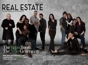
While groundbreaking research about the luxury real estate market certainly stands on its own as cover-worthy content, Better Homes and Gardens Real Estate believes that the visual component of a story is critical to driving a message home. Case in point: the brand’s creative dual-cover approach to the February issue of RISMedia’s Real Estate magazine. Here, Jennifer Marchetti, senior vice president of Marketing and Communications for the national franchisor, shares why one cover just wasn’t enough to paint the full picture of today’s luxury homebuyer.
 Maria Patterson: In a rare move, Better Homes and Gardens Real Estate opted to have two different cover images to represent its February issue cover story on the luxury real estate market. Please give us the background on this decision.
Jennifer Marchetti: The February dual-cover concept was really exciting for us as marketers. Luxury can mean many things to many people. To some, it can be the unattainable type of luxury where every vase and light fixture should be in a museum, or it could be a more accessible type of luxury where you leverage mass market brands like Restoration Hardware and mix them with custom pieces or family heirlooms. We respect the fact that luxury is different to everyone and this is what our two covers show. One cover gives a more traditional take on the concept—glamorous, haute luxury—and the other cover with the couple gives a nod to the next generation of luxury homebuyer: multi-cultural, effortlessly stylish, with modern sensibilities. It’s important for real estate professionals to understand both philosophies.
 MP: What does your research reveal about the luxury market?
JM: What’s evolving is that the more coveted luxury is the one none of us can buy: time. What we’re hearing from consumers is that the gilded age of luxury is giving way to an emotionally-driven luxury imperative where high-end homeowners are preferring smaller square footage to make better use of tech amenities and lifestyle amenities, like a movie theater or outdoor kitchen—or even better, multiple homes that reflect different aspects of their lifestyle that they want to share with loved ones.
What’s so encouraging about this new direction for luxury is that it puts perspective on what we’re working so hard for in American culture. Americans are beginning to “work to live,” which has traditionally been understood and embraced by other cultures, such as Europeans. Today’s luxury trend also shows that you don’t have to be in a certain income bracket to afford the luxury of quality time with friends and family. No matter what your income, if you keep that goal central in terms of your home, you’ll create the environment and experiences you are seeking.
 MP: This is not the first creative approach you’ve taken toward your Real Estate magazine cover stories. Tell us why you believe it’s important to be innovative in this area.
JM: When Sherry Chris started the brand, she built it with the core values we call “P.A.I.G.E.” – Passion; Authenticity; Innovation; Growth; and Excellence. When we talk about innovation, it doesn’t stop with technology, but extends into the creative realm of our business as well. We are doing our very best to understand the customer because it’s a customer-driven world in real estate. With our covers, we strive to combine our core value of innovation with the importance of representing the future of our industry. Looking back to our Millennials cover (Real Estate magazine, February 2013), our research was designed to tell a more accurate and positive view of that generation. Many business and consumer outlets were painting Millennials as the “me” generation. We knew that wasn’t true, and felt it was important to paint the right picture. With our Millennial  cover, our “Rolling Stone” cover (February 2012), and now with our two luxury covers, we knew that you could credibly tell the story through our original research data, consumer insights, and broker success stories, but to truly bring the point home—and have the industry take note and remember you—is through the creative piece. This is how Sherry has built her team to think—this kind of creativity is what we have the ability to do under her leadership.
MP: What do these creative cover concepts say about Better Homes and Gardens Real Estate as a brand?
JM: What’s most exciting about these covers is that we are working with a partner in RISMedia who understands the importance of quality editorial along with a visual message that really makes the point. Everything we do, whether it’s a magazine cover or art on the walls in our offices, comes from the brand legacy of Better Homes and Gardens. There is no one better at the art of visual expression than Meredith and Better Homes and Gardens, and Sherry takes that foundation very seriously. Our visual expression shows the brand’s forward-thinking ability. For example, the variety of people on last year’s Millennial cover represents the importance of homeownership to all different cultures and lifestyles. To some people that’s groundbreaking, but for us, that’s just reality. The year before, we asked Leighton Dees (broker/owner of Better Homes and Gardens Real Estate Generations) to jump on a trampoline countless times to achieve a rock-star shot—not too many brands would ask their brokers to do that, and not too many brokers would be willing to, but for us it made all the sense in the world because our brokers are all forward-thinking. Simply put, they all get it. That’s why it’s such a pleasure to support them with our national marketing.


